


Tools Used
Role:
Senior UI / UX Designer
Prototype
Animation
User Research
Tools:
Figma
Illustrator
Photoshop
After Effects
Sketch
Jira
Confluence
Members of the team:
Łukasz Szymański
Sourena Mansouri
Farzad Moghbel


Mission
To redesign the OutcomeMD electronic health records (EHR) dashboard to be intuitive, efficient, and user-centric, enabling healthcare professionals to navigate patient data and assessments with minimal friction and maximum clarity.
My Contribution
To create a seamless, data-driven medical interface that empowers clinicians to focus on patient care by reducing UI complexity, improving insight visibility, and facilitating faster decision-making across the healthcare workflow.
Electronic Health Records
User Centric Design
During my time at Outcome MD, I've dedicated myself to revamping the Electronic Health Records (EHR) system with a clear mission: to optimize the user experience. My goal has always been to design a dashboard that users can navigate effortlessly, minimizing frustration and maximizing efficiency. It's rewarding to create solutions that simplify complex processes, making it easier for users to manage their tasks and deliver the best care to their patients. Let’s connect if you want to learn more about my work in UX UI.

120K+
Active Patients in the platform working with the system
10–12
Clinicians Interviewed were conducted to analyze the data
6
Usability Testing with healthcare professionals
92%
Task Success Rate from final round of usability testing.
SiteMap
01
It was imperative to develop a comprehensive sitemap prior to the creation of wireframes in order to gain a clear understanding of how the medical dashboard operates. This process allowed for a deeper understanding of the various components and functionalities of the dashboard, ensuring that the wireframes accurately depicted the intended design and functionality of the interface.
02
By establishing a sitemap, a visual representation of the website's hierarchical structure and content, the design team was able to identify the key components and features necessary for the medical dashboard to effectively meet the needs of healthcare professionals. This step-by-step process helped to ensure that the final product is both user-friendly and intuitive, promoting ease of use and efficient navigation.
03
Overall, the creation of a sitemap before the wireframing process is a crucial step in designing an effective and efficient medical dashboard. This method ensures that the dashboard is well-structured, easy to navigate, and provides users with the necessary tools and features to effectively manage patient care.


Experimentation
We conducted a user research experiment using various designs and analyzed the optimal approach for presenting the data. Here are some of the examples that we created:


The data was pretty visible but some user reported confusion by using different colours and gradients on each section
The navigation bar on the top and the iconography on the left corner of the dashboard was too bold for the design, it was hard to find the data
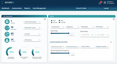
Behind Outcome MD Filters
At Outcome MD, we've designed our filters dashboard to enhance your user experience significantly. Special attention has been given to the filters located in the left corner, making it effortless for users to navigate and find exactly what they need. Our goal is to offer a seamless interface that caters to your workflow, allowing you to focus on what truly matters – achieving outcomes that drive results. Explore the intuitive design today and take control of your dashboard like never before.


Easy Navigation
We've reimagined the filters dashboard to enhance your user experience substantially. Our focus was on refining the color scheme and layout, making the navigation of the Patient list intuitive and seamless. These improvements, accessing the details and reports of each assessment has never been easier. We are committed to providing you with a user-friendly interface that helps streamline your workflow and enhance your productivity, enabling you to focus on what matters most.


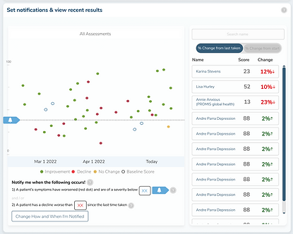
Graphs and Notification
At Graphs and Notification, we understand that a well-designed interface can significantly impact usability. That’s why we’ve implemented improvements to both color and layout to simplify navigation through the Patient list. Detailed reports of each assessment are now more accessible, ensuring that users can easily locate and interpret the information they need. Discover how we are committed to creating a better user experience for everyone.
Easy way to send Assessments
As part of my responsibilities for Walmart, I was tasked with leading the creation of their annual impact report for the year 2022. Working collaboratively with my team, I directed the development of all artistic elements, assets, and user experience and user interface design, ensuring a cohesive and effective layout for the report.
I was able to ensure that the final product was visually stunning, intuitive, and highly effective in communicating Walmart's key achievements and impact throughout the year. Overall, it was an incredibly rewarding experience that allowed me to showcase my leadership skills, creativity, and passion for delivering exceptional results.
When the tabs are close this is how it looks:

When the tabs are open this is how it looks:


Macleans's
Previews Project
Walmart
Next Project