
UX / UI Designer
Interface direction, responsive layout, motion assets, and campaign storytelling.
A UX/UI and motion system for retail pages that needed navigation users could predict, stronger campaign storytelling, and responsive consistency.
Interface direction, responsive layout, motion assets, and campaign storytelling.
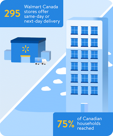
Navigation, homepage modules, footer systems, bilingual campaign assets, and mobile behavior.
Designed in 2022 during the Art Director tenure at SJC, partnering with the Walmart Canada team.
A focused agency sprint covering responsive layouts, footer systems, and EN/FR campaign rollouts.
The work focused on helping users move through Walmart content with stronger page hierarchy, more consistent modules, and stronger navigation cues.
I shaped responsive page layouts, animated infographic moments, and branded content systems that felt more lively without losing usability.
Walmart pages carry a lot at once: promotions, content stories, navigation, product discovery, language variants, and footer utilities. The UX work was about making those layers feel intentional instead of crowded.

The refined direction gave Walmart’s content more hierarchy, stronger brand presence, and a homepage rhythm that feels easier to move through.
The earlier direction felt flat because content blocks carried similar visual weight. Navigation, campaign content, and page modules needed stronger priority so users could understand what mattered first.
The updated homepage uses a stronger header, more intentional spacing, and modular content sections so the brand feels more current while the UX remains practical.
Walmart needed pages that could hold a lot of business and campaign content while still feeling quick to scan, clear to navigate, and visually connected to the brand.
Primary navigation, footer logic, and page anchors were treated as a UX system so users could orient themselves quickly.
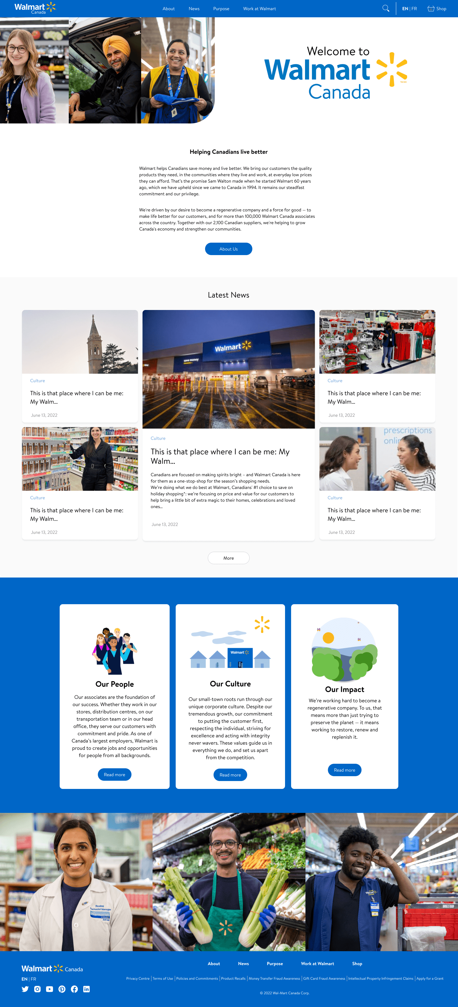
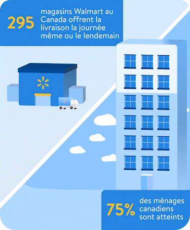
Animated modules gave brand content more personality while keeping the message scannable and lightweight.
Desktop, homepage, and mobile treatments were aligned around the same visual hierarchy instead of becoming separate experiences.
The UX direction organized page modules like a retail journey: land, understand the offer, browse the story, and always know where to go next.

Large surfaces needed room for promotions, categories, brand moments, and utility links without becoming a wall of content.

Sections were organized so campaigns, browsing paths, and product discovery could sit together without competing.

The page needed familiar retail wayfinding while still leaving space for custom campaign storytelling.
The animated modules helped Walmart content feel more memorable while still keeping each message short, visual, and easy to understand.

Instead of squeezing desktop work into mobile, the page system was rebalanced around purposeful stacking, tighter image crops, and more deliberate content rhythm.

Campaign content, navigation, and browsing modules were stacked so the story remained clear on narrower surfaces.

The page structure kept visual continuity while adapting image, copy, and navigation density.

Each page block had to work as its own story while still belonging to the full shopping experience.

The responsive system protected important page content from becoming squeezed or visually noisy.
The Walmart identity had to carry from hero content into the footer and the smallest utility moments, so the page felt consistent from first impression to final link.

Blue, yellow, bold navigation, and the spark mark gave the page system a stronger brand center.

Utility links, social icons, legal content, and about sections were organized as a reliable end-of-page system.

Even compact footer and social elements needed the same alignment, hierarchy, and brand consistency as the hero modules.
The strongest direction was not more decoration. It was a more navigable experience where navigation, responsive structure, and motion all supported the same Walmart story.
Retail UX works best when the user can enjoy the campaign without losing the path.