Senior UI / UX Designer
Prototype, animation, user research, and product interface direction.
A clinical UX/UI redesign for patient data that surfaces quickly, organized assessment flows, and faster decision-making.
Prototype, animation, user research, and product interface direction.
Collaborated with Lukasz Szymanski, Sourena Mansouri, and Farzad Moghbel.
Designed and shipped through 2022 alongside the OutcomeMD product team.
Six months of design and product work covering dashboards, assessments, reporting, and the supporting design system.
Make OutcomeMD more intuitive and efficient so healthcare professionals can navigate patient data and assessments with less friction.
I focused on insight visibility, data-driven workflows, navigation logic, and faster decision-making across the healthcare product.
OutcomeMD needed to feel less like a static record system and more like a working surface for care teams. The redesign focused on simplifying complex processes, reducing frustration, and helping clinicians manage patient tasks with fewer second-guesses.

The redesign focused on making navigation, filters, metrics, and dashboard actions easier to separate in the first scan.
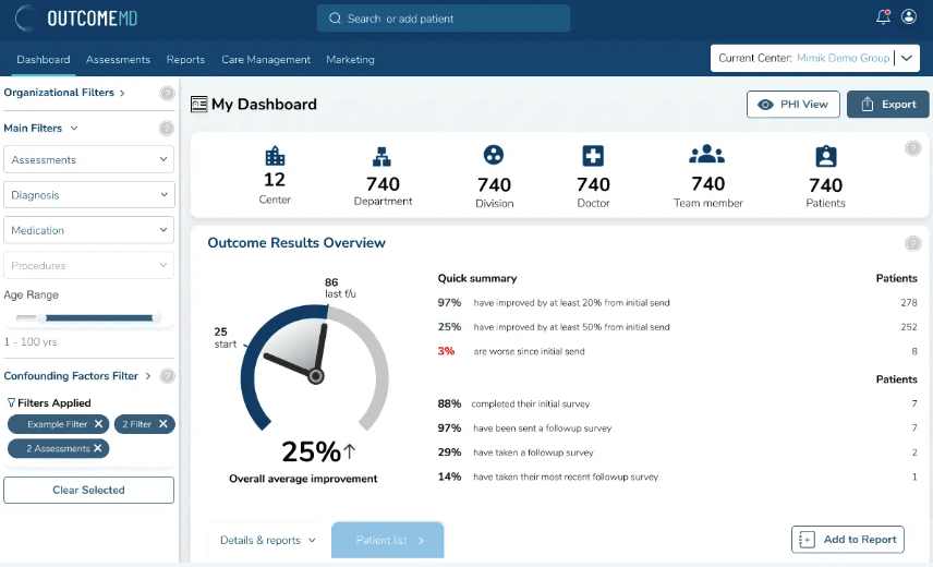
Too much was competing in the same view — clinicians had to dig before they could start.
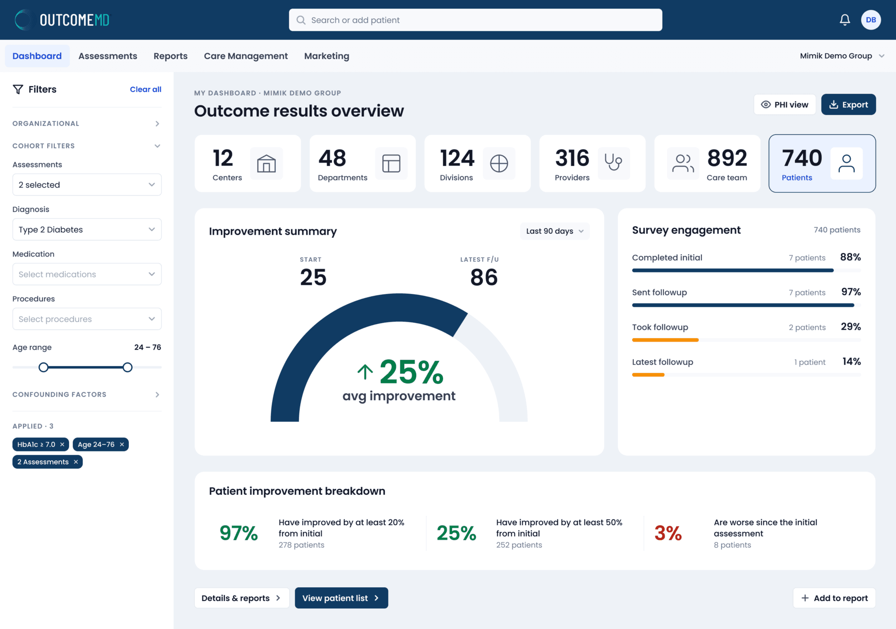
The refined dashboard separates filters, scope, summary metrics, and actions into visible zones so the full product is easier to scan and operate.
A guided carousel of research boards, flow maps, personas, tooling, and solution framing that explains how the UX direction was shaped.

Clinician interviews, task analysis, and platform data gave the redesign a measurable starting point.

The search path was mapped from login to dashboard, filters, patient list, assessment review, and return actions.

The process moved through synthesis, sitemap, wireframe, experiment, high-fidelity design, testing, and delivery.

Design, project management, collaboration, and research tools were organized around handoff and decision tracking.

Sprint rituals, responsibilities, risk management, and communication practices kept research and delivery aligned.

Personas clarified the needs of primary care, specialist, administrator, and patient-facing workflows.

The redesign focused on persistent filters, assessment flow, navigation that surfaces next steps, and a more usable layout system.
In clinical software, every extra moment of hesitation matters. The redesign reduced scanning effort, clarified the hierarchy of patient data, and made long assessment workflows feel less mentally expensive.
The dashboard was reorganized so outcomes, patient scope, and follow-up status could be understood before users dug into details.
Assessment selection, long forms, and record detail views were structured around progress, state, and next-action visibility.
Filters, result summaries, export actions, and patient lists share the same logic so users do not rebuild context at every step.
Before moving into detailed UI, I mapped the dashboard ecosystem so the product could support real clinical movement instead of isolated screens.

Dashboard entry points, assessments, reports, filters, and patient details were connected first so the interface could behave like one system.
The sitemap clarified how dashboards, assessments, reports, and patient details needed to connect before visual design started.
Centers, providers, patients, assessments, diagnoses, filters, and reports became the organizing structure for the product.
The final structure supported easier movement between scanning outcomes, filtering cohorts, and reviewing patient-level evidence.
A small but disciplined system underpins every screen — type, spacing, color tokens, and a focused component library. Tap a card to view each documentation page.
We explored multiple dashboard directions and used research feedback to understand which patterns made the data easier to find, compare, and trust.


Research showed that mixed colors, gradients, and competing panels made some users work harder to understand the hierarchy.

The top navigation and left icon system needed to become less dominant so clinicians could find the data faster.
OutcomeMD needed clinicians to segment patient data, move into reporting, and return to detail views without losing trust in the state of the system. The filter model was redesigned to stay persistent, visible, and easier to reason through.

And/or, include/exclude, select-all, and long diagnosis lists are exposed as deliberate choices for cohort building.

Life events, injuries, laterality, compliance ranges, and selected chips live beside the data they affect.
Provider, center, team, and patient selectors establish scope before completion gauges and outcome cards appear.

The dashboard compares baseline, follow-up, improved, and worsened values without making users decode raw tables first.
Outcome categories inherit the same scope, making it easier to compare clinical signals across a selected cohort.

Reporting actions remain beside the filtered view, so evidence can move directly into review or follow-up.

Patient names, status, scores, and movement are grouped so teams can inspect the evidence behind a trend.

Filtered rows, report fields, and notification setup give teams a traceable path from cohort to patient follow-up.
The work moved between overview dashboards, selection states, and long-form clinical tasks. The interaction model had to stay predictable even as density increased.

Available forms, selected assessments, and progress states are separated so clinicians can decide what to open next.

Closed sections reduce visual noise while preserving the structure needed for long clinical questionnaires.

Assessment inputs, patient information, and reporting context share one surface so completion feels grounded.
Beyond the shipped screens, the project included workflow maps, care-management explorations, and monitoring concepts that helped align the broader product behavior.

The flow shows where clinicians need to move from care management context into individual patient review without losing the thread.

Alerts, result movement, and patient lists transform outcome tracking from passive reporting into a follow-up workflow.
The strongest result was a more focused working surface for clinicians: less visual noise, visible priorities, and a product language that could support serious healthcare work with fewer second-guesses.
Strong healthcare UX reduces hesitation at the exact moment people need orientation.