
Tailoring a resume should take a minute, not an evening.
Most applications go through software before a person. Refynes rewrites the resume for each posting and shows the score, so people apply with a resume made for that job.
Paste a job. Ryn tailors the resume.
An AI resume app I designed and built: a companion called Ryn rewrites a resume for each job, shows the ATS score, and runs on one glass design system in light and dark.
Most applications go through software before a person. Refynes rewrites the resume for each posting and shows the score, so people apply with a resume made for that job.
From the first prompt to the paywall: the flows, the Ryn character, the light and dark glass system, the React app, the iPhone and Watch apps, and the AI calls through the Anthropic API.
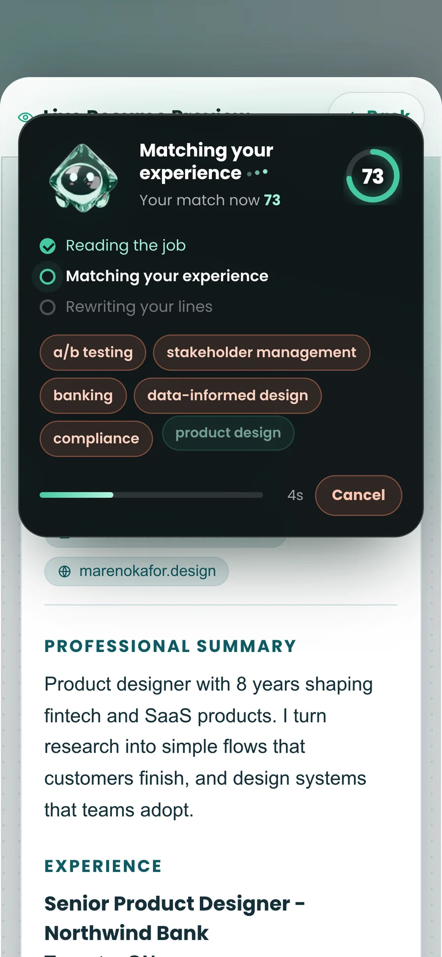
Tailoring takes several seconds of AI work. It used to be a looping animation. Now Ryn’s card shows what is happening: reading the job, matching the experience, rewriting the lines, the keywords it finds and the score as it climbs. Then every edit plays back, one at a time.
Keywords appear as Ryn finds them, coral when missing and mint when matched. The score ring moves with the work, not after it.
Cancel used to sit in a separate bar at the bottom of the screen. It moved inside Ryn’s card, beside the progress, and cancelling leaves the resume as it was.
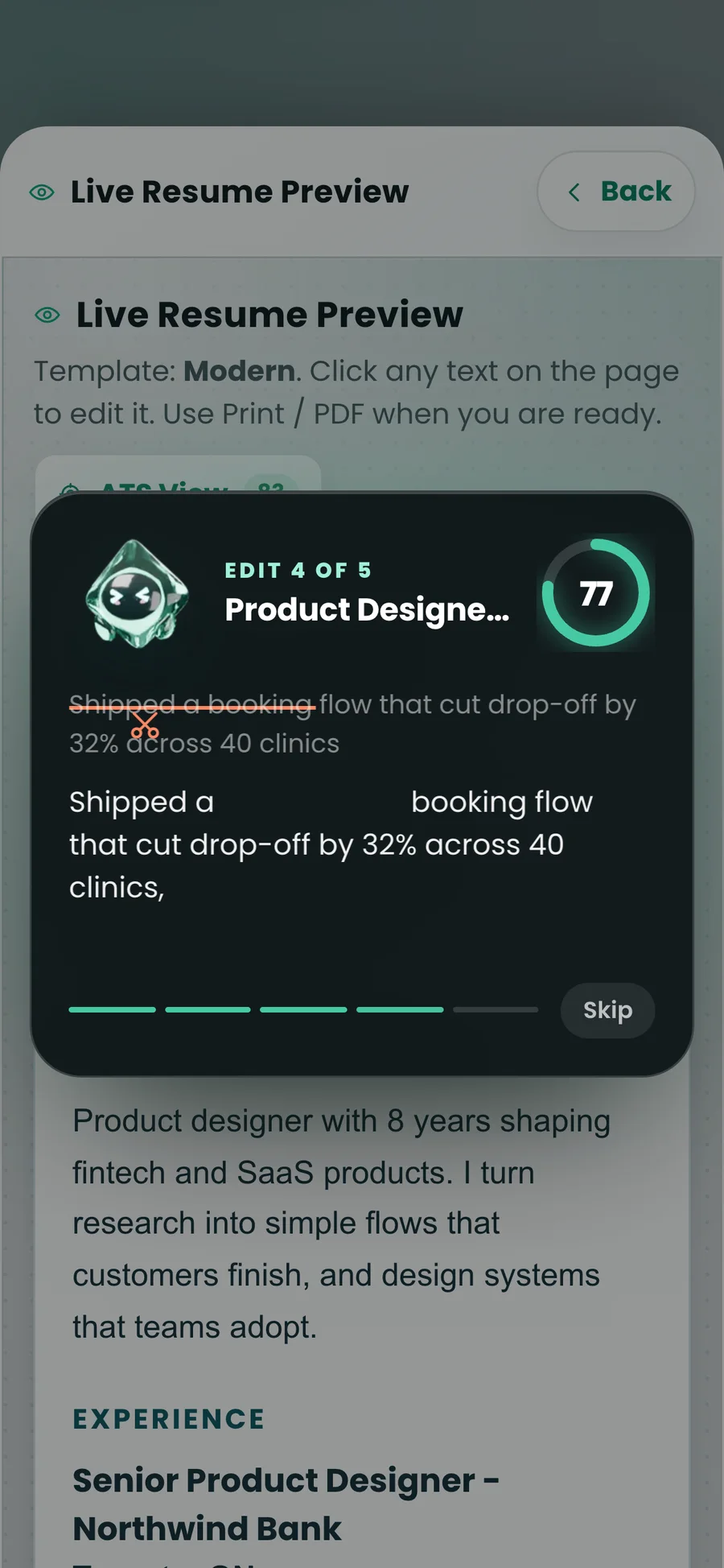
Each rewrite plays back with the old line struck through and the new words highlighted, so users see exactly what the AI did to their resume.
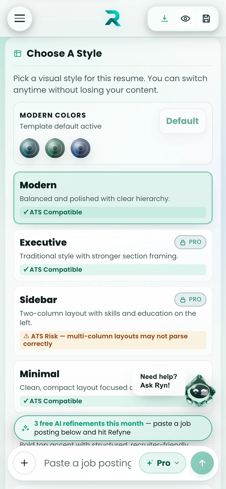
An ATS score is only useful if people can see why. One tap switches the resume to ATS View: formatting stripped, in monospace, the way a parser sees it. Styles say whether they are safe before anyone picks one.
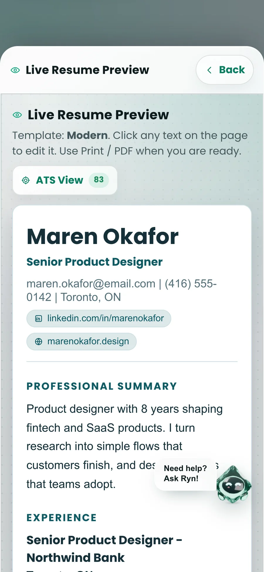
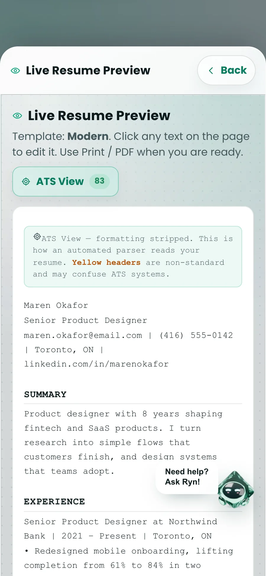
Monospace, no color, no columns. Headers a parser may not recognize are flagged in yellow.
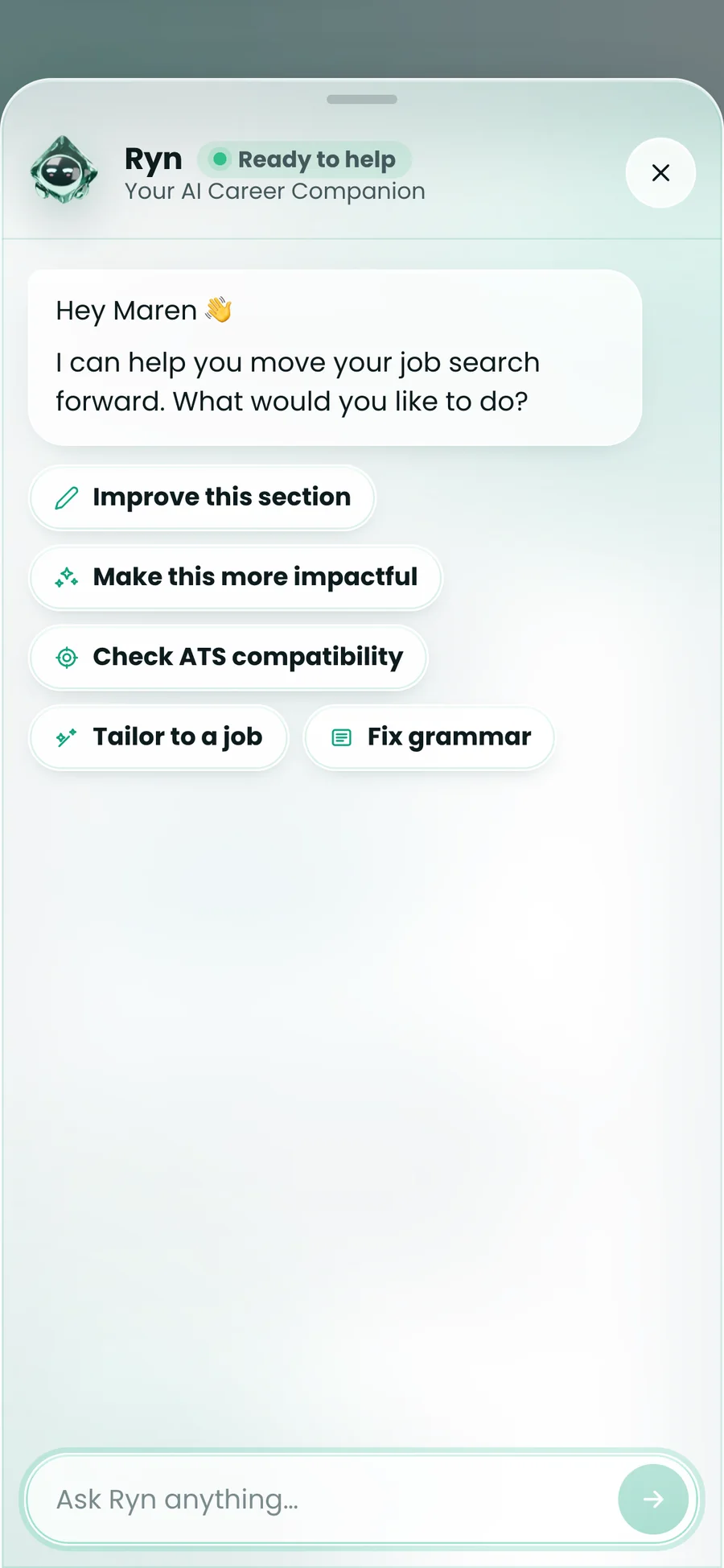
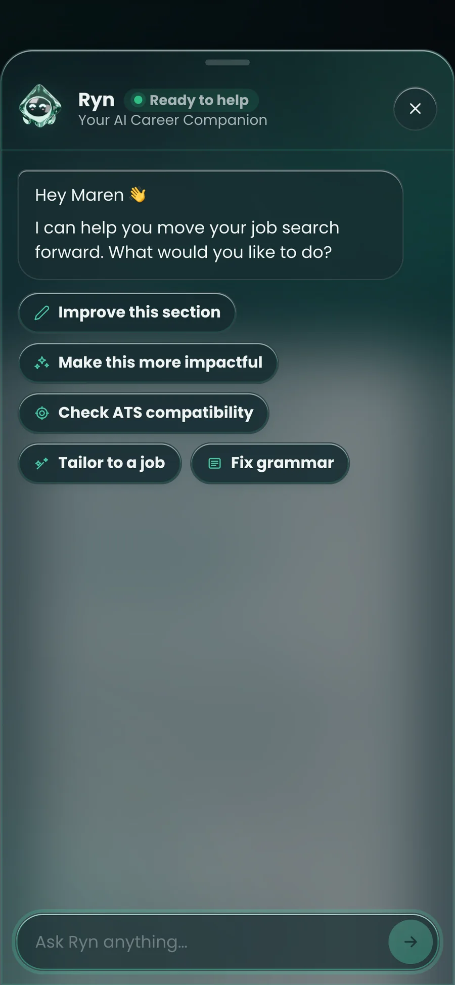
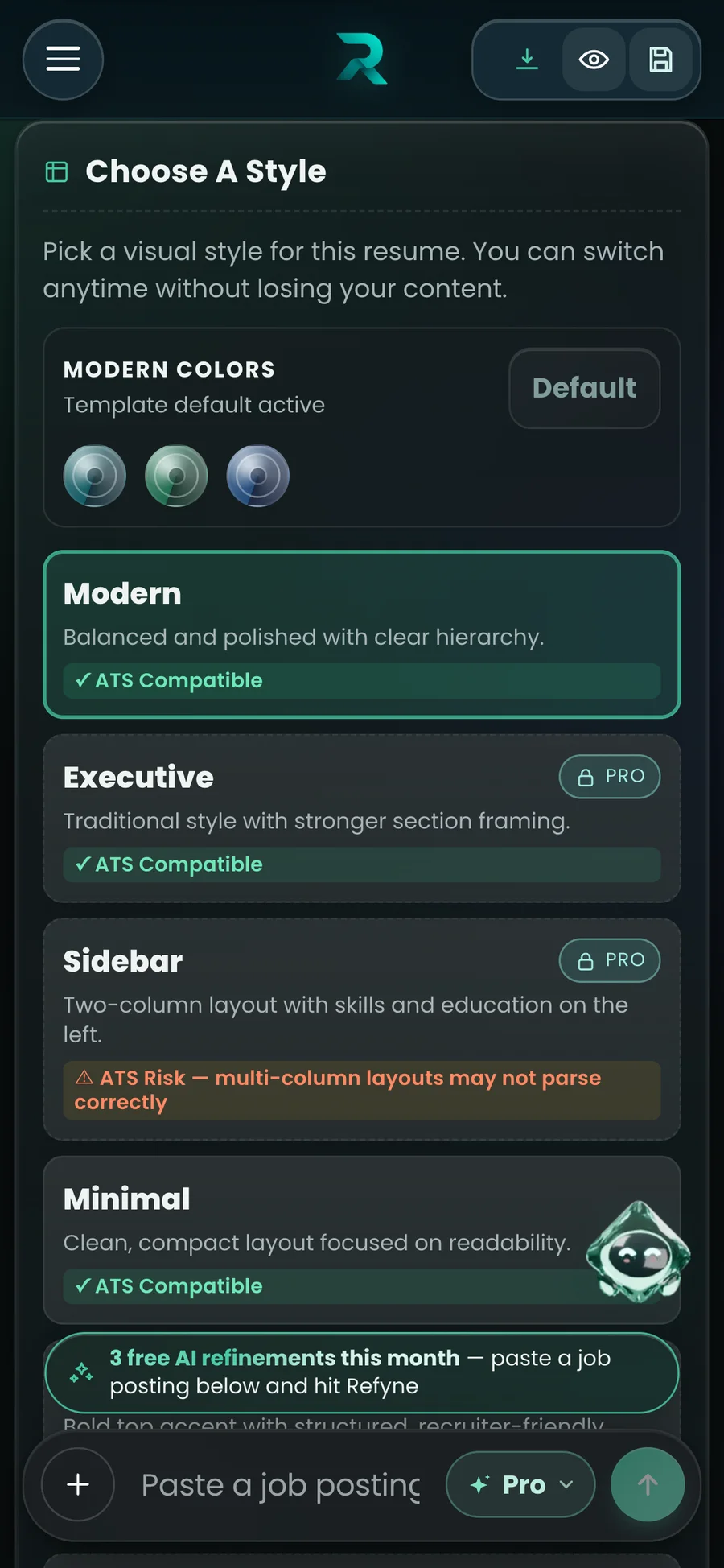
Two-column styles say “ATS Risk” on the option, before someone applies with a resume a parser may scramble. Ryn’s quick actions put the same checks one tap away.
The light theme had grown a grey haze, beige panels and solid teal selection slabs. I rebuilt both themes on one token set: the same names point at light values or dark ones, so every component works in both. Then I documented it atom by atom and measured it.
Selected cards are a soft tint with an emerald edge, never a solid block.
No component knows which theme it is in. They only use names like surface.glass and action.primary.
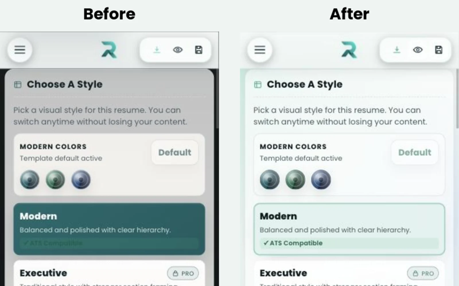
Building the library meant measuring every text and background pair in both themes. The fixes went back into the Refynes stylesheet, not just into the documentation.
Tokens for both themes, atoms through templates, a working Ryn tailoring card, and the measured fixes, as an interactive library.
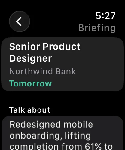
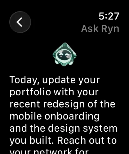
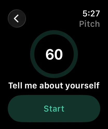
The Apple Watch companion pairs with a code and does a few things well: a reminder the day before an interview, a two-minute briefing, a pitch to rehearse, and Ryn by voice.
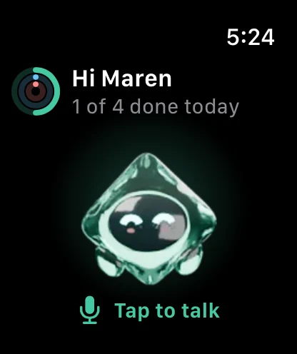
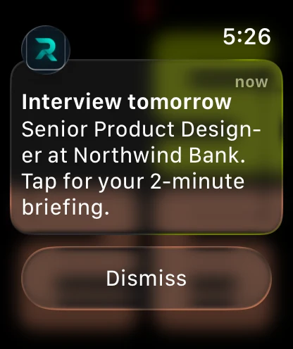
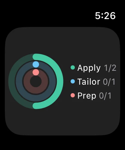
Four overlapping phases. Each one changed what the next one had to solve.
The core loop came first: paste a posting, get a resume rewritten for it, see the score. Every other screen exists to make that loop faster or more trustworthy, including the PDF import that reads two-column resumes in the right order.
Ryn started as a 3D model, rendered to sprites in Blender. Ryn guides empty states, answers questions and, most of all, narrates the tailoring run, which replaced an abstract loading animation.
An approved board, then a sweep of about 490 hard-coded colors onto one accent family and a shared set of glass tokens, so light and dark are the same components with different values.
The atomic library: tokens to templates, every pair measured in both themes. The five failures were fixed in the library first and then shipped in the app’s stylesheet.
What shipped, what is not measured yet, and what I would take further.
Refynes is early and its user base is small, so no conversion, retention or hiring numbers are quoted here.
I'd make the edit reel teach, not just show.
The reel shows each edit and lets people keep or skip it. It does not yet say why a change helps: which keyword from the posting it answers, or which ATS rule it fixes. One line of reasoning per edit would turn a review step into something people learn from for the next application.