UX / UI Designer
Marketplace flows, listing detail, responsive layouts, filters, and product UI direction.
A UX/UI direction for vehicle discovery, search results, filters, listing detail, and responsive shopping flows across desktop and mobile.

Marketplace flows, listing detail, responsive layouts, filters, and product UI direction.
Help shoppers search, filter, compare, and understand vehicle listings with less friction.
A responsive shopping experience that keeps search intent, listing context, and actions aligned.
Mar 2021 to Jun 2021 with the AutoTrader.ca brand-campaign team.
Four months covering brand campaign systems, marketplace surfaces, listing detail, and responsive behavior.
Auto shoppers arrive with different levels of certainty, so the experience needed to support broad discovery and precise filtering without making the interface feel heavy.
The work focused on search entry, results scanning, filter logic, vehicle detail structure, responsive behavior, and saved-shopping moments.
The redesigned direction treats vehicle shopping as a sequence: define intent, compare options, then move into detail with the right context intact.
The earlier flow asked shoppers to jump between criteria, listings, and vehicle details without enough visual continuity. The interface needed a stronger path from browsing to shortlist decisions.
Search entry, result scanning, and listing detail now feel like one product system, helping shoppers refine criteria without losing their place.
The marketplace needed to help shoppers move from open-ended browsing into practical comparison without losing their criteria or sense of progress.

Search controls are presented as the main action, with supporting content kept secondary to the shopper's intent.
Vehicle cards, filters, and page rhythm help users compare options without losing the result set.

Image, specs, pricing, and contact paths are grouped so shoppers can evaluate before reaching out.
The UX work treats vehicle shopping as an ongoing decision cycle rather than a single page visit.
The product keeps make, model, price, location, and body style close to the results so shoppers can adjust criteria in context.
Price, image, key specs, and dealership context are prioritized so the user can build a shortlist quickly.
The mobile flow protects search, result, and detail hierarchy instead of hiding core decisions in deep menus.
The page variations show how homepage entry, filters, saved states, and detail views connect into one shopping journey.


Tablet and mobile screens preserve the same search logic: define intent, compare options, review detail, and keep a route back to the shortlist.


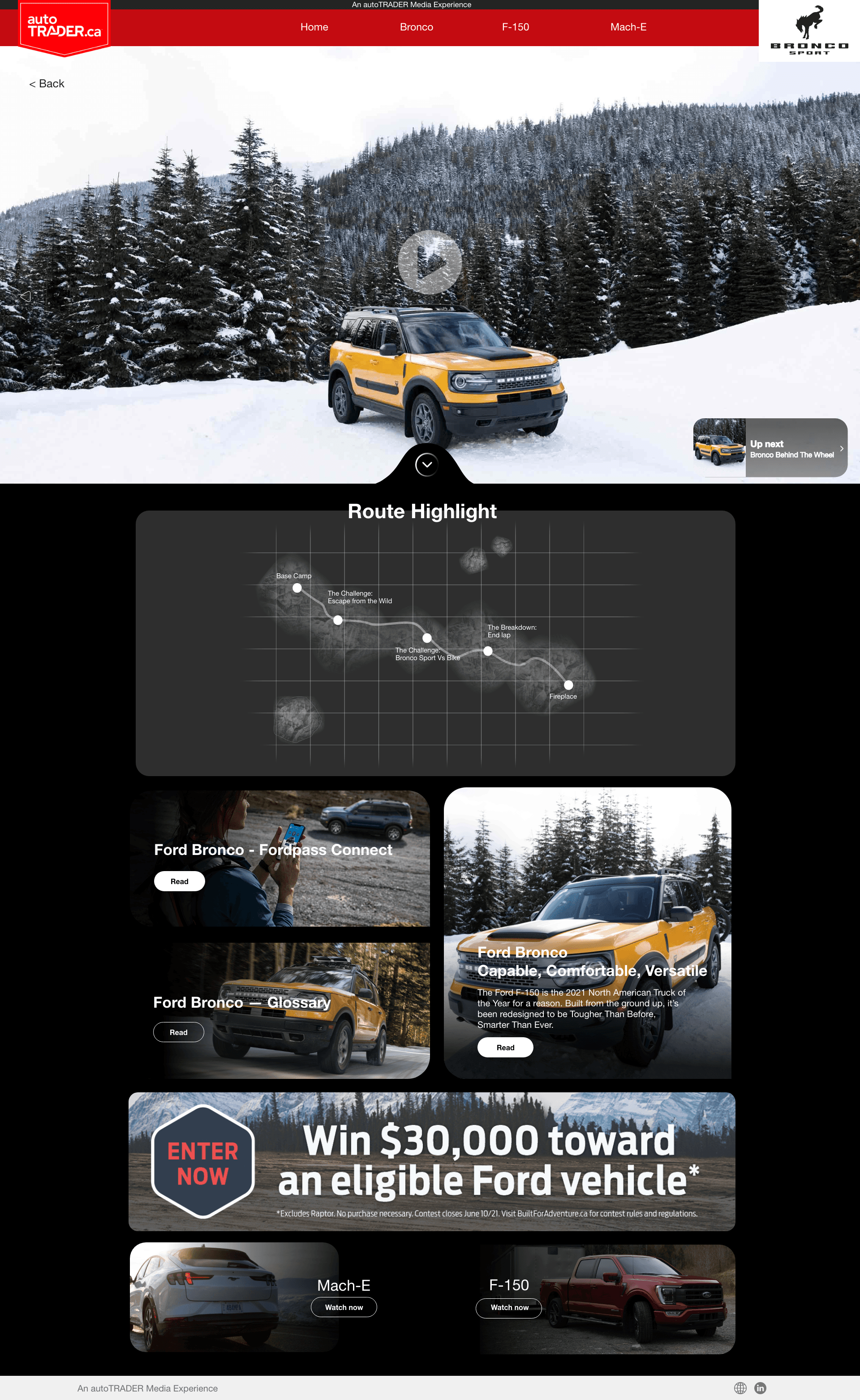
The same media framework supports very different brand stories — luxury cues for Audi, family warmth for Mazda, expressive contrast for Mitsubishi — without breaking the AutoTrader experience underneath.
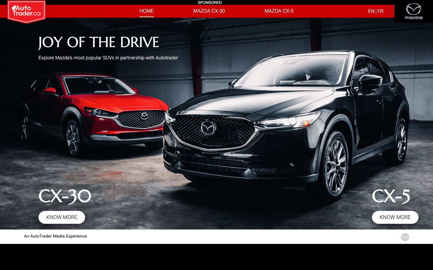
Side-by-side hero comparison surfaces that let shoppers explore the CX-30 and CX-5 inside one branded media experience.
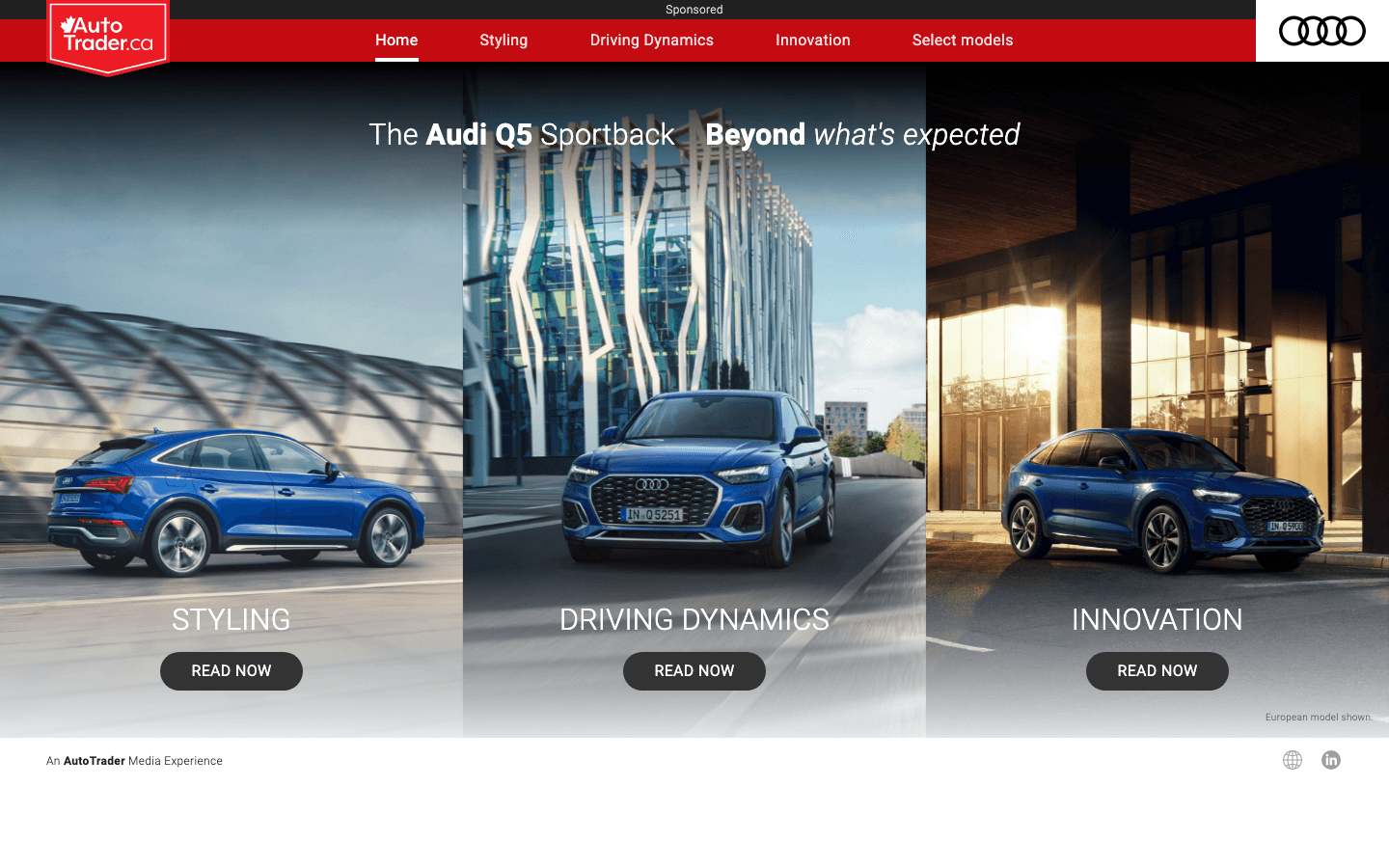
A three-pillar storytelling layout — Styling, Driving Dynamics, Innovation — that scales from a panoramic desktop hero into a single-column mobile flow.
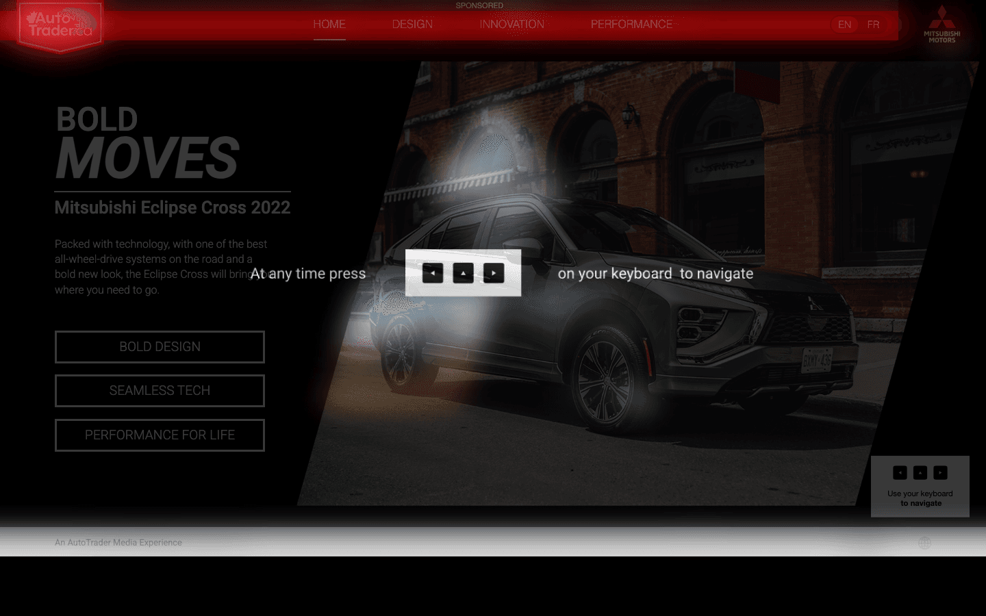
An interactive keyboard-driven exploration with bilingual EN/FR support, bringing Bold Design, Bold Eco-Tech, and Performance For Life into a single moody hero.
The long-form exports show how search, content modules, listing density, and decision paths can sit together without turning into visual noise.

Good search UX helps people narrow the field without feeling boxed in.


